
Wednesday, March 24, 2010


Tuesday, March 23, 2010
Kimiko

Another commission, but this was inked in ArtRage - I was actually quite impressed! Just noticed that I've signed the wrong year - what a dilbert...

Friday, March 19, 2010


Wednesday, March 03, 2010
Sendmail & MTA refusing connections with Puremessage
This is more of a reminder for me than anything else. If sendmail MTA starts refusing connections, it's probably because you have a lot of messages in the mail queue that are undeliverable, and are taking their time timing out. The refusal is caused because the sendmail demon is trying to run it's delivery queue too many times over the course of an hour - you probably have -q5m or something on sendmail's command line (process the queue every 5 minutes), change it to -q30m (30 minutes).

Friday, February 26, 2010

Wednesday, February 24, 2010
Arrrgggh!
For some reason, I'm sure that pencils hate me.
Recently working on another pinup (this time, the stunning Samantha (smcose)) when my 2mm green lead broke. Extend, sharpen, draw, SNAP! Repeat until lead runs out... I hate days like this, it breaks your concentration. Add to this that I've just bought 2 packs of leads (one staedtler blue/green, one staedtler F/HB), and I'm hoping I haven't just made a huge mistake.
Anyhow, managed to finish the nude sketch (clothing comes later in pinups), but my inking as usual, let me down I feel. This time, the sketch was inked using a bayard nib, a no.2 brush, and indian ink. It's better than my previous inks, but still not good enough - into Xara it will go, for final inking.

Have I mentioned how much I love Xara? It's so simple to use, gives great results, and I currently use nothing else. It's especially great for toon like pinups, as you can experiment with differant body shapes, colours etc, and it's all so non-destructive. It's also great for creating a collage as a reference for your sketches.
Next on my shopping list, is "The Wonderful World of Bill Ward, King of the Glamour Girls". This book is huge I tell you, and it's filled to the brim with Bill's wonderful cartoons and sketches. His use of conte crayon is fabulous - so good in fact, that I'm thinking of buying some to try...
Recently working on another pinup (this time, the stunning Samantha (smcose)) when my 2mm green lead broke. Extend, sharpen, draw, SNAP! Repeat until lead runs out... I hate days like this, it breaks your concentration. Add to this that I've just bought 2 packs of leads (one staedtler blue/green, one staedtler F/HB), and I'm hoping I haven't just made a huge mistake.
Anyhow, managed to finish the nude sketch (clothing comes later in pinups), but my inking as usual, let me down I feel. This time, the sketch was inked using a bayard nib, a no.2 brush, and indian ink. It's better than my previous inks, but still not good enough - into Xara it will go, for final inking.

Have I mentioned how much I love Xara? It's so simple to use, gives great results, and I currently use nothing else. It's especially great for toon like pinups, as you can experiment with differant body shapes, colours etc, and it's all so non-destructive. It's also great for creating a collage as a reference for your sketches.
Next on my shopping list, is "The Wonderful World of Bill Ward, King of the Glamour Girls". This book is huge I tell you, and it's filled to the brim with Bill's wonderful cartoons and sketches. His use of conte crayon is fabulous - so good in fact, that I'm thinking of buying some to try...
Tuesday, February 09, 2010

Monday, February 08, 2010

Wednesday, February 03, 2010
Meet...Voxie!

Something I've been meaning to do for a while now, is to create a very simple character, that's quick to draw, and that I can practice putting into various costumes/situations so I can develop my cartooning skills - with this in mind, I give you...Voxie!
He's a happy little chap, who can turn his hand to anything, even though he has quite a temper at times. I've tried to keep him to basic shapes (circle for the head, rectangle for the torso, half circle for the pelvis etc...) and so far it seems to be working. My next test is to costume him up - expect to see some soon...
Once I've got Voxie going properly, I'll give him a little girl friend perhaps... Voxette?
Monday, January 25, 2010
"Oh it must be wonderful, being able to do computers...."
I've lost count how many times I've heard this phrase. "Ooh, it's so glamorous!", or "Wow, you must be SO clever!", or my own personal favorite, "I bet you make s**tloads of money doing that!"
Let me enlighten you.
I spent two and a half hours today taking two printers apart, and replacing the fuser roller gearing on one printer (which were missing some teeth) with those from the other. By the end of it, I looked more like a mechanic than a programmer - covered in oil, filthy from head to toe.
All just to save money.
Laughed? oh yeah, I laughed alright... :(
To lighten the mood, here's another sketch - Legs...

Let me enlighten you.
I spent two and a half hours today taking two printers apart, and replacing the fuser roller gearing on one printer (which were missing some teeth) with those from the other. By the end of it, I looked more like a mechanic than a programmer - covered in oil, filthy from head to toe.
All just to save money.
Laughed? oh yeah, I laughed alright... :(
To lighten the mood, here's another sketch - Legs...

Friday, December 18, 2009
Snow Day...
Yup - Essex is snowbound, and me along with it! Never mind, at least I can work from home (provided the kids don't interrupt!)
Thursday, December 17, 2009
Xara - things to watch out for...

The above image is called "RainyEyes", and in producing it, I found the following things to watch out for in Xara...
- All line work should be on the same layer, especially if you plan on adding textures / transparencies to items that will be behind them (like skin...) - If you have to change the lines to accommodate, then do so...
- Special Effect lines (like fur) May cause problems with (1). Transparency doesn't work, because the line style isn't kept - your best bet is to overlay with another line, on a higher layer.
- Try to get your sketch as accurate as possible - although you can change the lines later, you'll have less work to do if the initial sketch is better.
- PSD export at 300 dpi is the best option when exporting for editing in other programs.
- If you plan on breaking lines to simulate penmanship, remember to set your line ends to round ends - also consider setting your corners to bevel.
Thursday, December 10, 2009

Wednesday, December 09, 2009

Tuesday, December 08, 2009


Friday, December 04, 2009
Jennifer and Sweetie


Two very quick sketches today - the poses are based on photos, but the cartooning is all mine. I'm more pleased with Jennifer (the top one), but I that's because I've got the head wrong in "Sweetie" - perhaps I'll do the inks in Xara, and see if I can't improve them a bit (the head needs to be smaller...).
Tuesday, December 01, 2009
Angry...!
I'm so bloody angry with myself. For the last two days, I've been doing some pinup cartoons, and I made the same mistake that I always make - I try and make them too realistic. Whenever I do that, I get frustrated, because I can't seem to get the picture right, and it's because I'm trying to copy the picture I'm taking the pose from, rather than use it to draw my own.
I wouldn't mind, but it's the same mistake I keep making time after time. it's SO BLOODY ANNOYING!!!!
Tomorrow, I will do better...
I wouldn't mind, but it's the same mistake I keep making time after time. it's SO BLOODY ANNOYING!!!!
Tomorrow, I will do better...
Friday, November 20, 2009
More comic work...
Ok - first up, meet Sprocket. Primary robot on-board Lucy's ship... 
He's quite a good egg, but sometimes he has attitude...

... as well as a set of rocket powered skates. He's chief cook and bottle washer too. Last, but by no means least, is Crykk and Honest Jock...
Crykk is the Engineer - someone you should have complete understanding with, which is a problem, as the only word that Crykk knows is "Crykk!" Luckily (for Him) Sprocket is fluent in Crykk. Honest Jock is the used spaceship salesman on WayPoint Station, who's primary purpose in life is to separate the Captain from his hard earned cash...
Some of these cartoons are shaded in pencil - this is deliberate, as I want to use them as a platform for futher work later on, possibly in ArtRage3... Yes, ArtRage3 is imminent, and it comes with a proper inking tool - my christmas's have all come at once...

He's quite a good egg, but sometimes he has attitude...

... as well as a set of rocket powered skates. He's chief cook and bottle washer too. Last, but by no means least, is Crykk and Honest Jock...

Crykk is the Engineer - someone you should have complete understanding with, which is a problem, as the only word that Crykk knows is "Crykk!" Luckily (for Him) Sprocket is fluent in Crykk. Honest Jock is the used spaceship salesman on WayPoint Station, who's primary purpose in life is to separate the Captain from his hard earned cash...
Some of these cartoons are shaded in pencil - this is deliberate, as I want to use them as a platform for futher work later on, possibly in ArtRage3... Yes, ArtRage3 is imminent, and it comes with a proper inking tool - my christmas's have all come at once...
Wednesday, November 18, 2009
Lucy and The Captain

These are a couple of characters I'm looking into for a new webcomic (I gave up the idea of the hamsters - not enough scope). I'm really please with these ones, although in the future, I'll probably change the black shirt - trousers for color, to improve the look. Lucy is the second in command of a trading ship, and is our much beleaguered heroine. Her Captain (name to come) is basically a well meaning, Captain Hastings type (utterly hopeless, in other words). Other characters will come soon, but as for these too, I'm happy enough with the design.
Tuesday, November 17, 2009
My Experiences with Bristol Board
This month, I finally got round to purchasing some Bristol Board, just to see how it compares. Up till now, I've used either straight 80 / 110 gsm copying paper, or 250 gsm smooth off-white card, so I took 1 A3 sheet of Bristol, and prepared to destroy it...
First impressions: very smooth. Lovely to pencil on, and you can erase really easily. So far so good then, so on to Inking...
Tried some dip pens and indian ink - not as impressed as I'd thought I'd be. Just as scratchy, and no real improvement. Brushes next, and yes, about the same. Then on to technical markers. Again, no real improvement, everything about the same. Bring on the brush pens...
Again, no real improvement, but I noticed more smudging, as if the ink was taking longer to dry. On to the LAMY fountain pens...
..And disaster! Smooth to work with, but noodlers absoluetly hates Bristol - it slides like a dog on ice! I was happy enough, until I came to rubbing out the pencils - smudge, smudge, smudge...
Also tried my UNI Signo white gel pen for correction... Got some strange results. Definitely depends on ink drying time being longer on Bristol.
Long and short? Use technical markers or brushes - everything else hit and miss. Makes me wonder if marker paper would be a better alternative...
On a side note, I'm starting to think about reducing my working pens to...
0.1, 0.3, 0.5, 0.7/0.8 Technical Markers - usually Pilot/Faber/Staedtler
Black brush pens - small and large, filled with acrylic ink.
First impressions: very smooth. Lovely to pencil on, and you can erase really easily. So far so good then, so on to Inking...
Tried some dip pens and indian ink - not as impressed as I'd thought I'd be. Just as scratchy, and no real improvement. Brushes next, and yes, about the same. Then on to technical markers. Again, no real improvement, everything about the same. Bring on the brush pens...
Again, no real improvement, but I noticed more smudging, as if the ink was taking longer to dry. On to the LAMY fountain pens...
..And disaster! Smooth to work with, but noodlers absoluetly hates Bristol - it slides like a dog on ice! I was happy enough, until I came to rubbing out the pencils - smudge, smudge, smudge...
Also tried my UNI Signo white gel pen for correction... Got some strange results. Definitely depends on ink drying time being longer on Bristol.
Long and short? Use technical markers or brushes - everything else hit and miss. Makes me wonder if marker paper would be a better alternative...
On a side note, I'm starting to think about reducing my working pens to...
0.1, 0.3, 0.5, 0.7/0.8 Technical Markers - usually Pilot/Faber/Staedtler
Black brush pens - small and large, filled with acrylic ink.
Friday, October 30, 2009

Thursday, October 22, 2009
Character Designs - Fuzz

Meet Fuzz. Fuzz is a hamster character I'm working on for a new comic I'm planning. Looks cute doesn't he? How wrong you would be, because Fuzz is a hamster with attitude! The first version is done with Lamy's, the others with mapping nib and brush.
Wednesday, October 21, 2009
It's no good...
I've tried, and tried and tried...
...but I can't create digitally.
I've tried different types of software to create my cartoons - Artrage, Manga Studio, OpenCanvas, Painter... the list goes on and on. I've tried digitally inking, pencilling, vectors, everything.
And I hate them.
I love paper and ink. There, I've said it. I'd rather pick up a pencil and draw my cartoon, ink it with pens and brushes, rather than try to re-create the feel of it digitally. There's just something so bloody sexy about it. If you're reading this Cathy, I think I'm beginning to understand where you're coming from now.
Having said all that, I still feel happier colouring digitally - I like correcting my mistakes after all!
Keep watching people, because I'm working on a new fluffy project right now, and you'll be the first to see the previews - watch this space peeps!
...but I can't create digitally.
I've tried different types of software to create my cartoons - Artrage, Manga Studio, OpenCanvas, Painter... the list goes on and on. I've tried digitally inking, pencilling, vectors, everything.
And I hate them.
I love paper and ink. There, I've said it. I'd rather pick up a pencil and draw my cartoon, ink it with pens and brushes, rather than try to re-create the feel of it digitally. There's just something so bloody sexy about it. If you're reading this Cathy, I think I'm beginning to understand where you're coming from now.
Having said all that, I still feel happier colouring digitally - I like correcting my mistakes after all!
Keep watching people, because I'm working on a new fluffy project right now, and you'll be the first to see the previews - watch this space peeps!
Friday, October 16, 2009
Honest answers required...
Well, I'm in a bit of a quandary. I'm trying to work out if I prefer my line art using Xara, or inking by hand - what do YOU think?
First off, a tramp (or is it a former RBS employee?)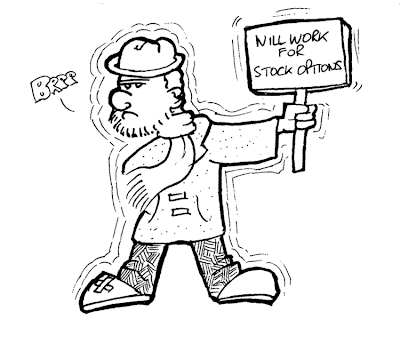 Secondly, a practice piece inked in Xara - am I wasting my time?

One thing I have noticed - the whole process is faster by hand...!
First off, a tramp (or is it a former RBS employee?)
 Secondly, a practice piece inked in Xara - am I wasting my time?
One thing I have noticed - the whole process is faster by hand...!
Friday, October 09, 2009
More Ladies
Couple of more girls today. We have a girl at a party...

... and a mum (or auntie) and her baby (aaawww!)

I think both show that I'm getting better!

... and a mum (or auntie) and her baby (aaawww!)

I think both show that I'm getting better!
Thursday, October 08, 2009
Lamy Girls (warning ** nudity **)
I said there would be some updates soon didn't I? Here are my LAMY Girls - warning, there is nudity...
Here is my greek girl, and the first one drawn this week (you should notice that they get progressively better!)

Now it's Action Girl - yes, I know the boobs are off...

Now it's Goth Girl - generally better than the previous too - except for the feet (what was I thinking?)
Now for Action Girl - complete with "Monkey" style staff, and getting better still...
Lastly, Nude Girl - MUCH better all round, including the pose (this also has the destinction of being the first drawing withe new Uni Eno Soft Blue leads)...

What do you think? Note for myself - Greek Girl has best arms, Nude Girl has best overall figure and style.
Here is my greek girl, and the first one drawn this week (you should notice that they get progressively better!)

Now it's Action Girl - yes, I know the boobs are off...

Now it's Goth Girl - generally better than the previous too - except for the feet (what was I thinking?)

Now for Action Girl - complete with "Monkey" style staff, and getting better still...

Lastly, Nude Girl - MUCH better all round, including the pose (this also has the destinction of being the first drawing withe new Uni Eno Soft Blue leads)...

What do you think? Note for myself - Greek Girl has best arms, Nude Girl has best overall figure and style.
News...
Interesting week so far. My last compo toon got 2 points, amid some very stiff competition, but it was the first one to use my new Lamy Nexx. I've now got some Uni Eno Soft Blue leads from Taiwan in my favourite tech pencil, and I love 'em! They're much nicer to use than the Pilot Blue leads that I have been using (lighter, much more erasable), and I feel much more comfortable using these when I'm drawing.
I've been doing a lot of Toon ladies in the last week, as I'm trying to get a more sensual female character style (including changes to lips, body proportions etc..) but hands are still my bogey item! I'll post some soon, once I'm happy with how they're going (there will be some nudity - you have been warned...)
Perhaps I'll take some pictures of my drawing kit soon - just for future reference... :)
I've been doing a lot of Toon ladies in the last week, as I'm trying to get a more sensual female character style (including changes to lips, body proportions etc..) but hands are still my bogey item! I'll post some soon, once I'm happy with how they're going (there will be some nudity - you have been warned...)
Perhaps I'll take some pictures of my drawing kit soon - just for future reference... :)
Friday, October 02, 2009
Thoughts on the LAMY Nexx...
OK - MY Lamy Nexx (with EF Nib) has finally arrived, thanks to those good people at The Writing Desk. So far, I've been very impressed by it. It has a lovely feel, thanks to the aluminum barrel & rubber grip, and it's balance is good. It seems a bit easier to handle than the Lamy Safari (at least, for drawing), although it's a similar size, but the star of the show is definitely the nib. Smooth (for a fine nib), fast & free flowing. Expect to see more work from me soon, using this new pen... :)

Tuesday, September 29, 2009
Formula Romanii

When Bert the Ancient Britain, suggested to Ignoramus about the possibility of a new sport...
"You know, like a chariot race, where we can compete for a.. a.. Trophy like, and each clan can enter a chariot or two, and we can get sponsors...."
...I don't think he had this in mind. But, Ingormaus is nothing if not a traditionalist...! Anyway, he's heard about a new kid on the chariot racing block, Jensonus Buttonus...
WOW - I've been cartooning for over a year...
... and I hadn't even noticed the anniversary!
I can't believe it's been a over a year since I started - it seems like forever, and I don't mean that in a horrible way either. it's just been so quick...
Anyhow, my "lemmings" cartoon didn't get any points this week - too many people had the same idea, however, I made a quick change to the caption, and now it works better...

And Steve Bright liked the idea of a lemming called "Leopold"!
I can't believe it's been a over a year since I started - it seems like forever, and I don't mean that in a horrible way either. it's just been so quick...
Anyhow, my "lemmings" cartoon didn't get any points this week - too many people had the same idea, however, I made a quick change to the caption, and now it works better...

And Steve Bright liked the idea of a lemming called "Leopold"!
Monday, September 28, 2009
Billious being, well...
 Billious just LOVES girls. And it's always a bad idea to walk past a barracks full of horny legionnaires anyway... The motion lines on the leg are wrong - just more stuff I've got to practice...
ArtPen, and Lamy Safari. New pen is on it's way - A Lamy NEXX with an extra fine nib...
Friday, September 25, 2009

Last of the Romans, and other bits

Bits and bobs this. A trek-type character, a space harlot of some kind, and a test Legionaire.
Quick note - the last few posts have been drawn using my new favourite tools - Rotring ArtPens and Lamy fountain pen, all filled with Noodlers Ink.
Romans 3 - Characters
 More character work. (from left to right - top row) Billious, Centurian Stomachus Grossus, Ignoramus (Bill's best mate), General Motus, (bottom Row) Brutus Maximus, Billious (again), and two views of Secretia (our love interest)...
Romans 2 - More Design Work

More design work for a possible comic. The big guy is Brutus Maximus - the real "muscle" in Billious's little squad of grunts...
Romans - Billious

I've been reading some history books about my home town of Colchester recently - it's really suprising how much actually went on around here you know. Anyhoo, it got me thinking about creating some comic characters that could be set in Roman Colchester (Camulodunum to you), the biggest city in Roman Britain. Meet Billious - a typical Roman Legionaire...
Friday, September 18, 2009

Monday, September 14, 2009
At the Garage
 I've actually seen this happen...
I was at the garage the other day, waiting to fill my poor old Honda with it's beloved petrol, when I noticed the car at the pump in front of me rocking from side to side. As I looked closer, I saw a very agitated young man seemingly kicking his car, and almost pulling his door off! On closer inspection, I realized that the man had parked his car with the filler cap a) on the wrong side of the pump and b) too far from the pump. With this in mind, the man was trying desperately to get the pump nozzle to reach - by pulling it with all his might.
With visions of our petrol station suddenly going up in smoke (and me with it), I hurriedly filled my Honda, and left tuit suite! The cartoon came later on...
Friday, September 11, 2009
Bernie and the Builder

I've been building a patio for the last 3 weeks - can you tell? I've got cuts, bruises, morter rot, sand fly, berri berri and stomach cramps - just from moving the bloody slabs! Used my pain as an inspiration for this cartoon, which was inked using Dip pens and indian ink.

Meet Bernie. Bernie is my daughter's cat, and he's a maniacal bundle of fur, held together with fat and attitude. Trouble is, he's got such a cute face! As above, inked using Dip pens and indian ink. In both cases, I'm using a manuscript mapping nib for the drawing, Speedball b5.5 for the outline (really needs a thinner outline, say a b6).
Bernie
Tuesday, September 08, 2009
Funny... The Answer!
Figured my problem out. It isn't my drawing as such - i'm reasonably happy with my current style, nor is it my method. It's my lack of animation.
I recently bought a Looney Toons dvd box set, and whilst I was watching it, I realised why I like cartoons in the first place - it's the action. All the double takes, the crashes, wallops, zipping around, punch-ups, chases - it's all action.
I started to look at my old cartoons, and with a couple of exceptions, everything I've done is too static - there's no movement. What I need to capture is a real sense of movement in my cartoons. With that in mind, I'm looking into the work of Roger Smythe (Andy Capp) and Tim Harries (Never Say Dai) - both these cartoonists have a very regimented style (like mine), but they exude movement - let's see if I can capture some of that in my next work...
I recently bought a Looney Toons dvd box set, and whilst I was watching it, I realised why I like cartoons in the first place - it's the action. All the double takes, the crashes, wallops, zipping around, punch-ups, chases - it's all action.
I started to look at my old cartoons, and with a couple of exceptions, everything I've done is too static - there's no movement. What I need to capture is a real sense of movement in my cartoons. With that in mind, I'm looking into the work of Roger Smythe (Andy Capp) and Tim Harries (Never Say Dai) - both these cartoonists have a very regimented style (like mine), but they exude movement - let's see if I can capture some of that in my next work...
Monday, September 07, 2009
Funny...
After the last post, I'm beginning to think that I may have gone wrong somewhere. I don't think that my cartooning has improved much recently - too much drawing, not enough cartooning. I few weeks of getting back to basics I think in my sketch book...
Friday, September 04, 2009

Pens Again - The Update!

Ok - All my pens have now arrived. I bought 3 Zig Dual tip pens (Black, Cool Grey and Blender), a Pentel Sign Pen, a Papermate Nylon and a Uni POSCA black fine tip (I already have the white fine tip).
First impressions: The Sign pen and the Nylon are practically the same - good for quick sketches in the sketch book (the Sign Pen is slightly better at line & wash). The Zigs - well, I'm not sure. Very versatile, but the ink is slightly purple when used with line & wash - although the grey is nice (wish I had picked a darker shade though...).
The real start however, is the marker that was bought as a afterthought - the Uni Posca black fine tip. The tip is a bit harsh, and can feel a bit scratchy, but the line - lovely! Not much variance, but nice and black, with almost no bleed, and it dries fast. The added advantage is that the white version of the marker can cover the black extremely well (just make sure it's really dry first). This is one of the problems I had when I brought the white marker - on many of my pens, it couldn't cover them up (even the so called waterproof ones) - but it just loves the black POSCA.
I may even be thinking of buying more of these markers in future...
Wednesday, September 02, 2009
Kuretake woes
You'll remember from my last post that I love using the Kuretake Fude pen. Well, not any more, as I've hit a big snag with it. I like drawing on white card (i can get it cheap, it holds up well to rough erasing, and I can use wet media on it), but the Fude Pen doesn't like it. It's started leaving big blobs of ink, which leads to smudging. Looks as if the ink is having trouble being absorbed by the card, or there is simply too much ink being sent to the nib. Either way, it's nasty. I've drawn a piece half an hour ago, and some of the ink is still wet!
The card I've used before for colour work, and is usually fine. I've noticed that my new sketchbook doesn't like the Kuretake ink either...
If I can't get this sorted out, it will be the end for the Kuretake.
The card I've used before for colour work, and is usually fine. I've noticed that my new sketchbook doesn't like the Kuretake ink either...
If I can't get this sorted out, it will be the end for the Kuretake.
Tuesday, September 01, 2009
Pens Again!
Yes, it's that time of the month - pay day!
I'm looking at more pens again (I'm such a pen whore - the amount I have is ridiculous) and I'm going to go for more of a graphic look. I've been using fineliners mostly (0.7, 0.5 & 0.1), but I'm still a big fan of the Kuretake Fude Pen (see the Coyote cartoon) which is slowly becoming my favourite - so much in fact, that I've started looking at other brush pens.
I've already got Copic, Faber & Pentel brush pens, but they all have the same problem - too floppy. The Kuretake is much stiffer, and suits my drawing style more. However, there are other types of brush pens - the dual ended markers, which have a bullet tip at one end, and a foam brush tip at the other. Top of these are the Tombow & KureTake brands, so I'm going to buy two of each - one in black, and one in light grey (for shading) and see how these go...
I'm looking at more pens again (I'm such a pen whore - the amount I have is ridiculous) and I'm going to go for more of a graphic look. I've been using fineliners mostly (0.7, 0.5 & 0.1), but I'm still a big fan of the Kuretake Fude Pen (see the Coyote cartoon) which is slowly becoming my favourite - so much in fact, that I've started looking at other brush pens.
I've already got Copic, Faber & Pentel brush pens, but they all have the same problem - too floppy. The Kuretake is much stiffer, and suits my drawing style more. However, there are other types of brush pens - the dual ended markers, which have a bullet tip at one end, and a foam brush tip at the other. Top of these are the Tombow & KureTake brands, so I'm going to buy two of each - one in black, and one in light grey (for shading) and see how these go...
Subscribe to:
Posts (Atom)





 Posts
Posts


